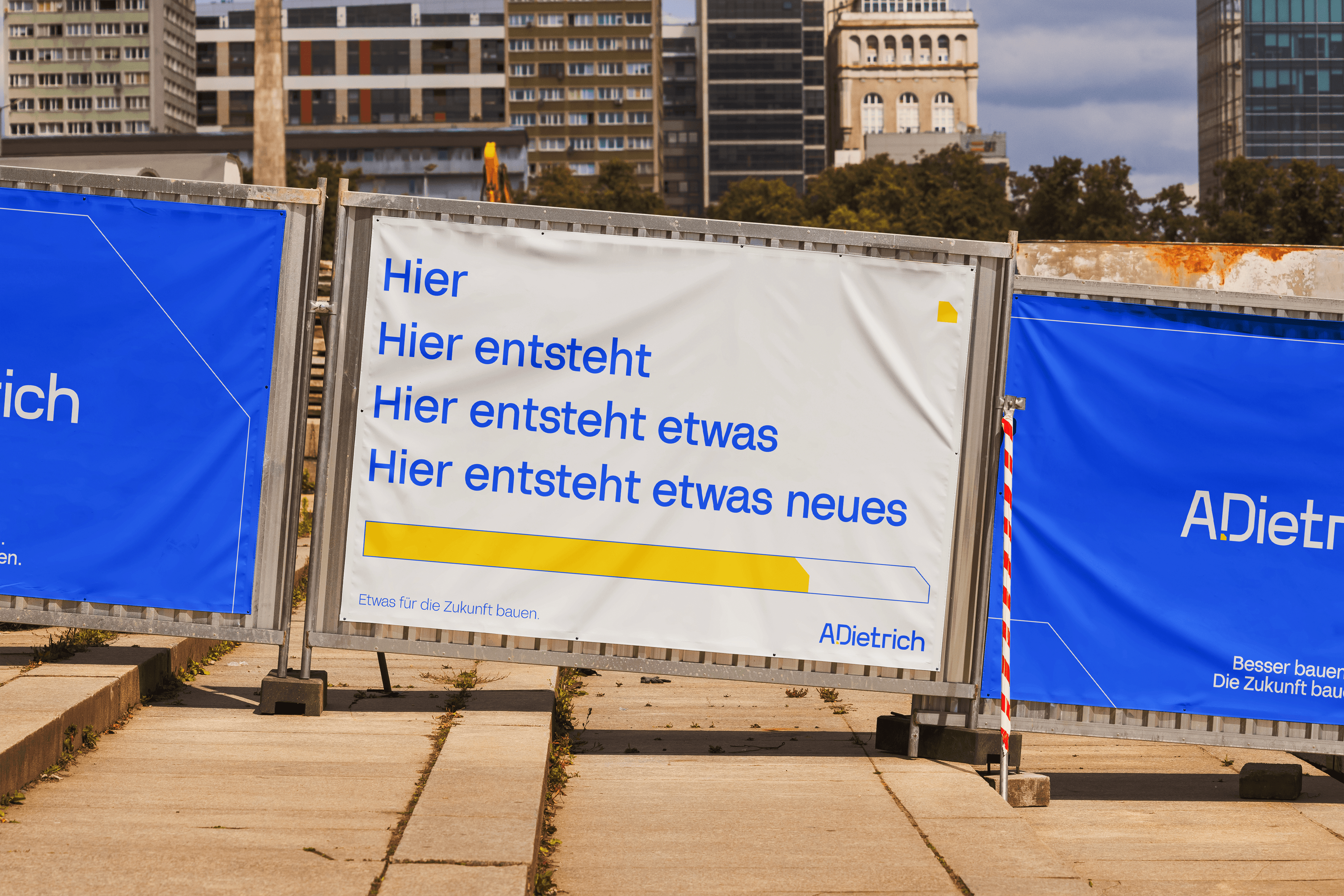
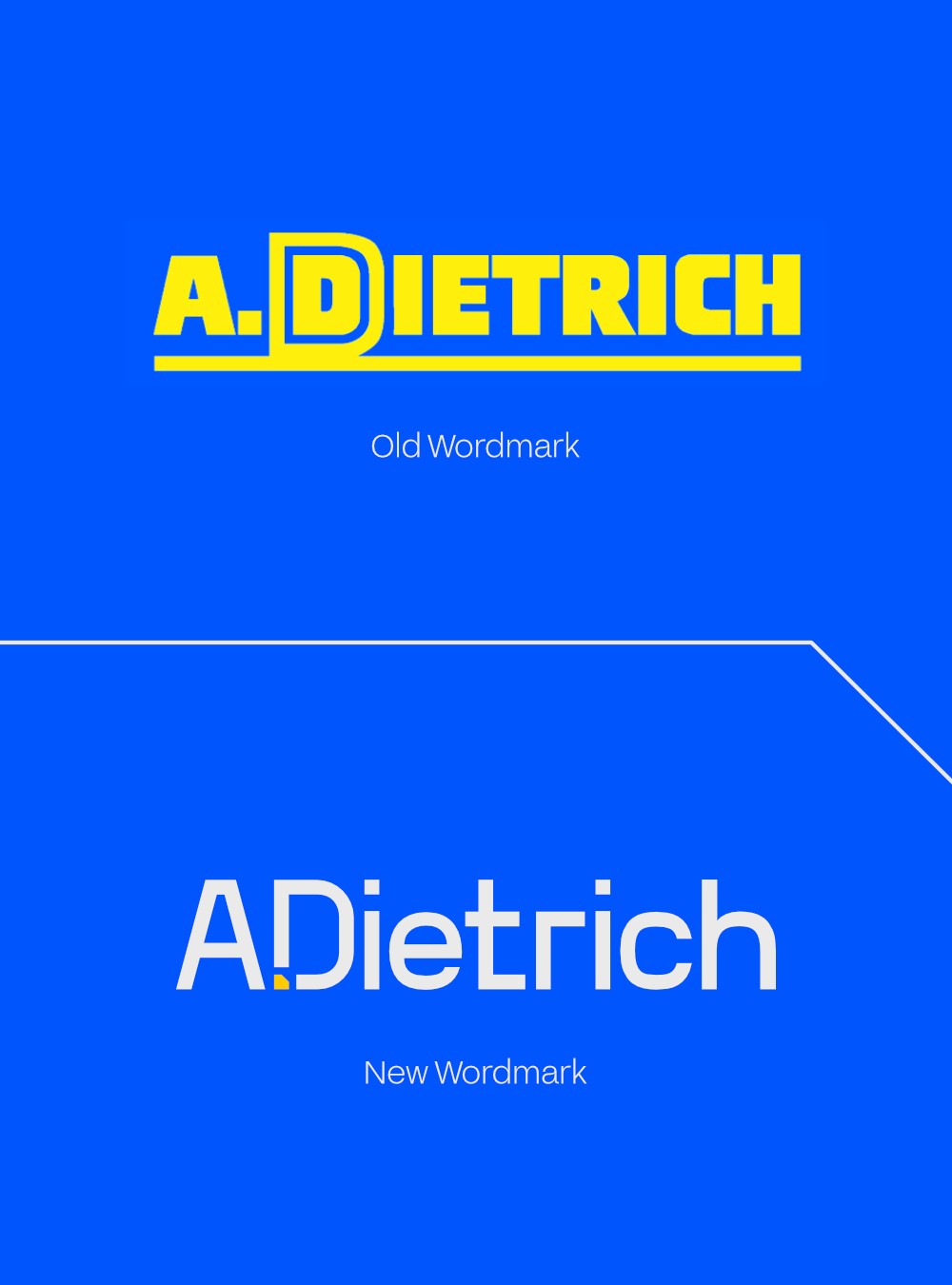
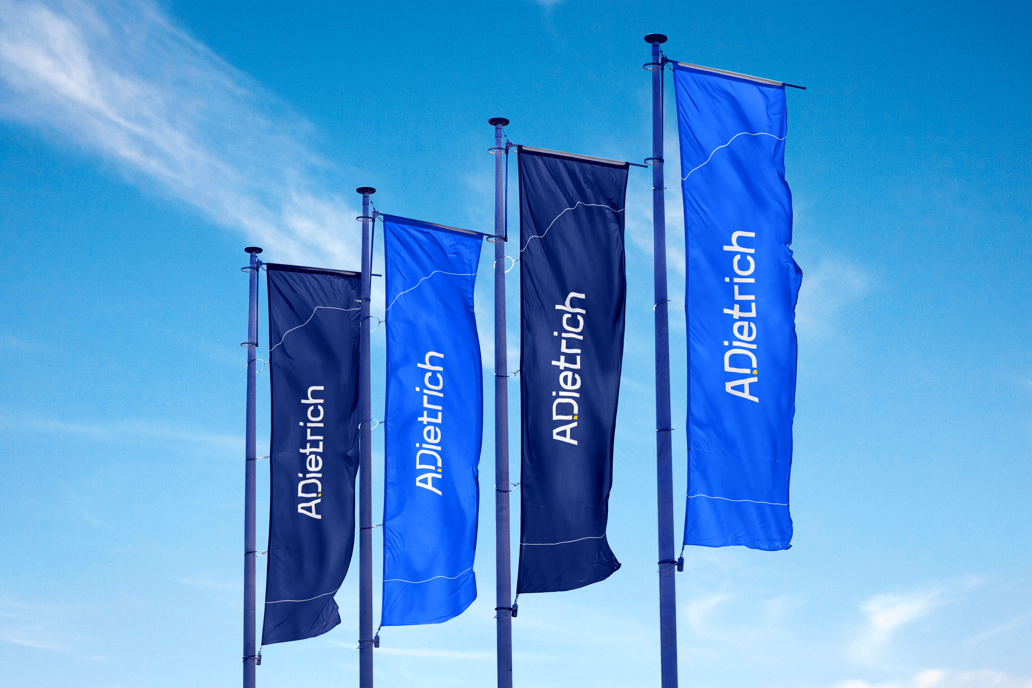
Swiss construction is known for its precision, but A.Dietrich also brings a human touch to every project, so their rebrand needed to reflect both. I designed a wordmark that mixes square angles with rounded shapes, balancing technical rigor with approachability.
The dot in A.Dietrich became a design opportunity. That single cutout became the foundation of their visual system: a repeating pattern, a frame for imagery, a construction block that ties everything together. Paired with clean sans serif typography and their signature blue, the brand will feel as precise and intentional as the structures they build.
Client
A. Dietrich
Year
2026
Category
Manufacturing & Industrials